Introduction

In this blogpost we will present the possibility to find out whether the advertisement strategy for the newly introduced product has had a significant effect on its sales volume.

Imagine you have introduced a new product on the already well known and stable market, where other products of yours have already been established and consumed with the predictable volume outcome.

This new product can actually be anything. This could be a new box of chocolate that’s comparable with your already existing types and brands.

This could even be a new service (like a new on-line credit card), which is supposed to enhance and / or replace an already existing one.

The goal of the analysis would be to assess whether the new product is pushed sufficiently well by the accompanying advertisement campaign, in other words: whether it has already been doing better on the market due to the active advertisement than its direct or indirect counterpart, which has already been there for a while and isn’t promoted as active as the new one.


The Data for the upcoming analysis

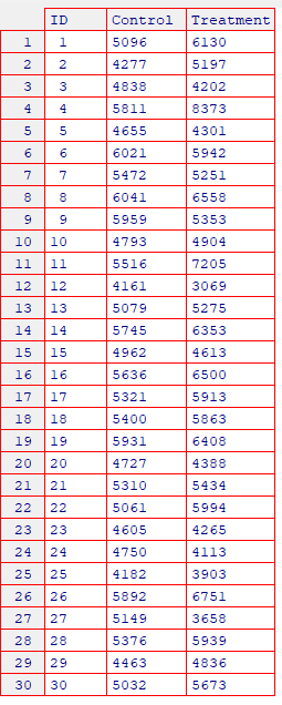
For the purpose of this analysis, we’ve collected a sample of 30 measurements (units / pieces sold within a month of June in 2023) for the newly introduced product, as well as the same corresponding amount of sold units for the already established and comparable product that wasn’t advertised as actively as the new one.

The data table would, thus, look as follows:

As one can see, all 30 measurements are presented side by side for the new, as well as the established products.

The new product is referred to as the “Treatment”. The initial one (established one) is the so called “Control” element.

The reason for these designations is that the new product is supposed to be tested against the old and comparable one, which is referred to as the “Control” series. Taking into account that the new product is treated differently, namely it is advertised actively and intensively, - its designation is, thus, the “Treatment”.

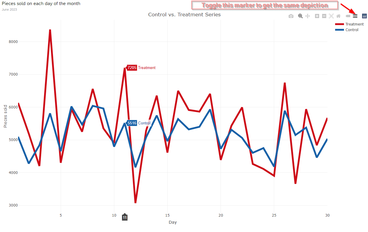
So, let's depict both series in a single line graph:

The code to produce this plot within an R Widget is listed below:

----
 

dta <- ttest_data
dta$ID <- as.character(dta$ID)
dta$ID <- as.numeric(dta$ID)

require(plotly)

fig <- plot_ly(dta, x = ~ID) 
fig <- fig |> add_trace(y = ~Treatment, name = "Treatment", mode = "lines", type = "scatter",
                        line = list(color = "rgb(205, 12, 24)", width = 6)) 
fig <- fig |> add_trace(y = ~Control, name = "Control", mode = "lines", type = "scatter",
                        line = list(color = "rgb(22, 96, 167)", width = 6)) 
fig <- fig |> layout(title = "Control vs. Treatment Series",
                     xaxis = list(title = "Day"),
                     yaxis = list(title = "Pieces sold"))                        
fig
 

----

The graph above shows a sort of dominant behaviour of the new product (Treatment) in comparison to the old one (Control).

Yet there are days, when the new product is also kind of slacking and lies slightly or even considerably behind the sales volume of the old product.

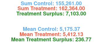
Let’s calculate and present some summary statistics for the two products depicted above:

Indeed, the new product has a surplus of 7103 units sold throughout the whole month, which corresponds to the average daily surplus of approximately 236.77 units.

But how can we say if this surplus is actually not random, meaning it is indeed the effect of the advertisement and not the artifact of the random fluctuation of daily customers’ behaviour?

In this second case, this observed surplus is only present in this particular sample of 30 daily observations (the first month after the introduction on the market) and is purely due to the random fluctuations caused by the "lucky chance" alone.

Our task would be to rule out this assumption of randomness and luck, and to actually prove the significant effect of the advertisement campaign.

For this purpose we will conduct a so called T-Test for paired Samples.

This test is one of the many available statistical significant tests that are used for leveraging the assumption of randomness versus the significant effect assumption.

If you ask, why specifically this test then?

Well, there are some hints in our data that point to the direction of this particular test.

First of all, one can observe that the patterns of the both series are somehow similar, especially if one considers the time period between the 15th and the 20th of June.

Furthermore, if we analyze the correlation between these two series, it is obvious that the corresponding correlation is positive and relatively high in magnitude.

This means that when the sales of the old product go up, the same happens to the sales of the new product and vice versa.

These two findings (the similar patterns and the strong positive correlation) pinpoint to the T-Test for paired samples as a test for statistical significance of the advertisement campaign.   

There are obviously the same factors that affect the both series in the same way simultaneously. Something like the particular day of week (weekend consumption behaviour may be similar for the both series), or mayhap even the weather on a particular day effects the both series in the same way.

That’s why in this case we assume that the two series are paired as they tend to go in the same direction as a response to the same affecting factors.

Thus, a strong positive correlation between the two series and a similar pattern in their course.

Below is the correlation graph:

The Code to produce this graph looks as follows:

----

dta <- ttest_data
dta$ID <- as.character(dta$ID)
dta$ID <- as.numeric(dta$ID)

control   <- dta$Control
treatment <- dta$Treatment

par(family = "mono")
plot(control, treatment, pch = 16, col = "steelblue2", las = 1, main = "Control vs. Treatment Correlation",
     font.main = 2, cex.main = 1.8, adj = 1)
grid()
title(sub = paste0("Corr: ", round(cor(control, treatment), 2)), font.sub = 2, cex.sub = 2.0)
 

----

But please remember that if your data doesn't show a strong positive correlation nor the similar structural pattern, then please consider using the T-Test for two independent samples instead!


Paired Samples T-Test

So, let's actually conduct this paired samples T-Test and depict its results in a graphical way inside an R Widget.

The Code to accomplish this is presented below:

----

dta <- ttest_data
dta$ID <- as.character(dta$ID)
dta$ID <- as.numeric(dta$ID)

control   <- dta$Control
treatment <- dta$Treatment
par(mar = rep(0, 4))
plot(NA, NA, xlim = c(0, 1), ylim = c(0, 1), ann = FALSE, axes = FALSE)
text(0.5, 1.0, paste0("Sum Control: ", format(sum(control), nsmall = 2, big.mark = ",")), xpd = TRUE, font = 2, cex = 1.5, col = "steelblue2")
text(0.5, 0.95, paste0("Sum Treatment: ", format(sum(treatment), nsmall = 2, big.mark = ",")), xpd = TRUE, font = 2, cex = 1.5, col = "tomato2")
text(0.5, 0.90, paste0("Treatment Surplus: ", format(sum(treatment) - sum(control), nsmall = 2, big.mark = ",")), xpd = TRUE, font = 2, cex = 1.5, col = "forestgreen")

text(0.5, 0.75, paste0("Mean Control: ", format(round(mean(control), 2), nsmall = 2, big.mark = ",")), xpd = TRUE, font = 2, cex = 1.5, col = "steelblue2")
text(0.5, 0.70, paste0("Mean Treatment: ", format(round(mean(treatment), 2), nsmall = 2, big.mark = ",")), xpd = TRUE, font = 2, cex = 1.5, col = "tomato2")
text(0.5, 0.65, paste0("Mean Treatment Surplus: ", format(round(mean(treatment) - mean(control), 2), nsmall = 2, big.mark = ",")), xpd = TRUE, font = 2, cex = 1.5, col = "forestgreen")

text(0.5, 0.55, "_______________________", xpd = TRUE, font = 2, cex = 1.5, col = "gray70")

text(0.5, 0.45, paste0("Mean Value at Stake: ", format(round(t.test(treatment, control, paired = TRUE)$estimate, 2), nsmall = 2, big.mark = ",")), 
     xpd = TRUE, font = 2, cex = 1.5, col = "forestgreen")
text(0.5, 0.35, paste0("Corresponding P-Value: ", format(round(t.test(treatment, control, paired = TRUE)$p.value, 2), nsmall = 2, big.mark = ",")), 
     xpd = TRUE, font = 2, cex = 2.0, col = "gray30")
text(0.5, 0.25, ifelse(t.test(treatment, control, paired = TRUE)$p.value < 0.05, "Mean Value at Stake is statistically significant", "Mean Value at Stake is not statistically significant"),
     font = 2, cex = 1.0, col = "gray50")
text(0.5, 0.15, "**********", font = 2, cex = 1.5, col = "gray70")
 

----

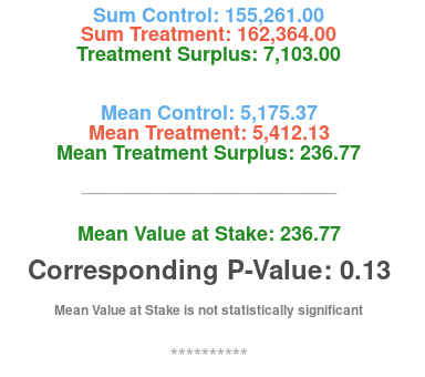
... generating the following graphical output:

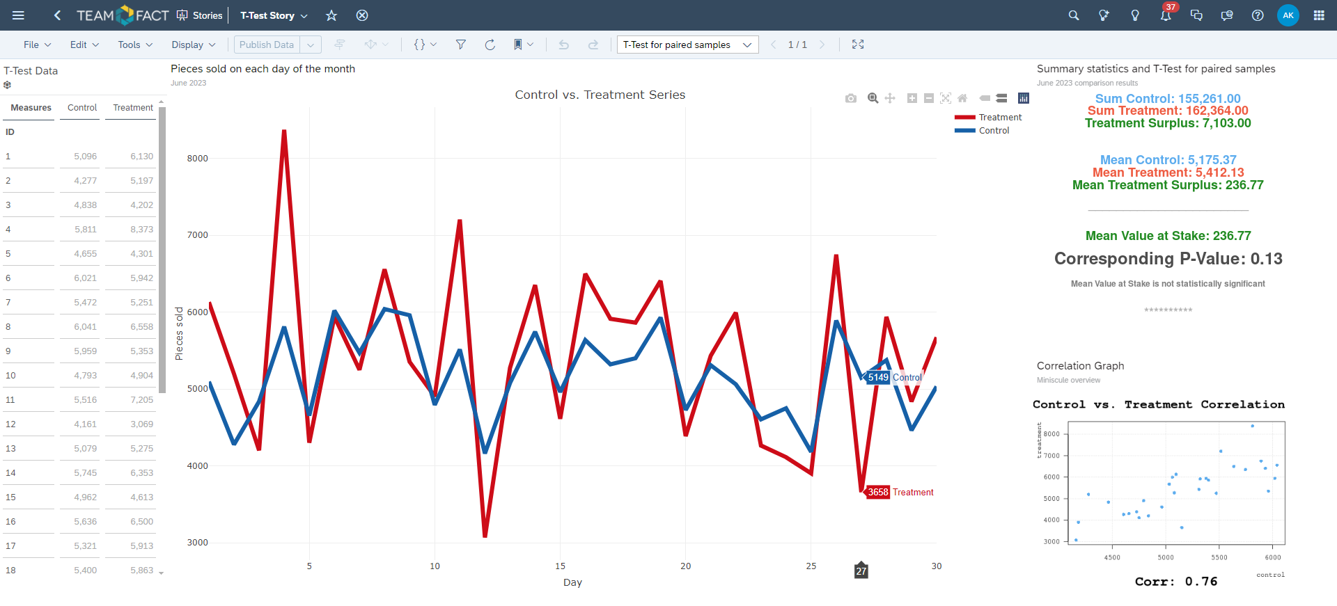
So, basically what this test does, is checking whether this Mean Treatment Surplus (Mean Value at Stake) of app. 236.77 units sold per day is significantly different from zero, meaning the advertisement campaign does indeed have a positive effect after all.

The indication of this significant effect is the so called P-Value generated by the test.

Please remember as a rule of thumb that a P-Value below 0.05 only is considered to be a clear indication of the significant effect in the Treatment series.

In our case this value is app. 0.13, which postulates that this surplus in a Treatment series is actually absolutely random and should be attributed to the vagaries in the customers’ behaviour! It is definitely not due to the advertisement campaign, as was thought previously!

So, a product manager or a category manager should definitely rethink the product placement strategy, i.e. changing the advertisement spot on T.V. and other digital media.

(Or maybe just improve the quality of the new product per se… :-) )


In the picture below is the complete SAC Dashboard, where the actual data table itself is a SAC native table widget, and the rest of the graphs presented above are depicted inside the three separate R Widgets with the corresponding R Code listed previously and the same dataset attached to every one of them:


Final Remark

If you are willing to use the Code in your own dashboards, - it’s actually quite easy to adapt.

All you need to do is simply change the first line of every Code snippet in a corresponding R Widget:

"dta  <-   ttest_data"     into something like     "dta  <-   <your_data_name>".

The rest of the Code should remain as is.

And be sure that your data is structured in exactly the same way as the one we presented in this blogpost, namely the three columns with exactly the same column names (ID, Control, Treatment), where the ID column is a dimension attribute and the rest two are measures.


All things considered: Have fun while testing!  :-)